Strangely enough, if you want to make something that will appeal to future generations, one way to do it is to try to appeal to past generations. It's hard to guess what the future will be like, but we can be sure it will be like the past in caring nothing for present fashions. So if you can make something that appeals to people today and would also have appealed to people in 1500, there is a good chance it will appeal to people in 2500.
GOOD DESIGN SOLVES THE RIGHT PROBLEM. The typical stove has four burners arranged in a square, and a dial to control each. How do you arrange the dials? The simplest answer is to put them in a row. But this is a simple answer to the wrong question. The dials are for humans to use, and if you put them in a row, the unlucky human will have to stop and think each time about which dial matches which burner. Better to arrange the dials in a square like the burners.
A lot of bad design is industrious, but misguided. In the mid twentieth century there was a vogue for setting text in sans-serif fonts. These fonts are closer to the pure, underlying letterforms. But in text that's not the problem you're trying to solve. For legibility it's more important that letters be easy to tell apart. It may look Victorian, but a Times Roman lowercase g is easy to tell from a lowercase y.
Problems can be improved as well as solutions. In software, an intractable problem can usually be replaced by an equivalent one that's easy to solve.
Physics progressed faster as the problem became predicting observable behavior, instead of reconciling it with scripture.
GOOD DESIGN IS SUGGESTIVE. Jane Austen's novels contain almost no description; instead of telling you how everything looks, she tells her story so well that you envision the scene for yourself. Likewise, a painting that suggests is usually more engaging than one that tells. Everyone makes up their own story about the Mona Lisa.
Figure 9-1. 1973 Porsche 911E.
In architecture and design, this principle means that a building or object should let you use it as you want: a good building, for example, will serve as a backdrop for whatever life people want to lead in it, instead of making them live as if they were executing a program written by the architect.
In software, it means you should give users a few basic elements that they can combine as they wish, like Lego. In math it means a proof that becomes the basis for a lot of new work is preferable to one that was difficult, but doesn't lead to future discoveries. In the sciences generally, citation is considered a rough indicator of merit.
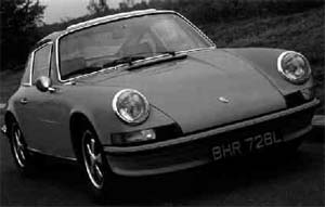
GOOD DESIGN IS OFTEN SLIGHTLY FUNNY. This one may not always be true. But Durer's engravings and Saarinen's Womb Chair and the Pantheon and the original Porsche 911 all seem to me slightly funny. Godel's incompleteness theorem seems like a practical joke.
I think it's because humor is related to strength. To have a sense of humor is to be strong: to keep one's sense of humor is to shrug off misfortunes, and to lose one's sense of humor is to be wounded by them. And so the mark—or at least the prerogative– of strength is not to take oneself too seriously. The confident will often, like swallows, seem to be making fun of the whole process slightly, as Hitchcock does in his films or Bruegel in his paintings (or Shakespeare, for that matter).
Good design may not have to be funny, but it's hard to imagine something that could be called humorless also being good design.
GOOD DESIGN IS HARD. If you look at the people who've done great work, one thing they all seem to have in common is that they worked very hard. If you're not working hard, you're probably wasting your time.
Hard problems call for great efforts. In math, difficult proofs require ingenious solutions, and these tend to be interesting. Ditto in engineering.
When you have to climb a mountain you toss everything unnecessary out of your pack. And so an architect who has to build on a difficult site, or a small budget, will find that he's forced to produce an elegant design. Fashions and flourishes get knocked aside by the difficult business of solving the problem at all.
Not every kind of hard is good. There is good pain and bad pain. You want the kind of pain you get from going running, not the kind you get from stepping on a nail. A difficult problem could be good for a designer, but a fickle client or unreliable materials would not be.
In art, the highest place has traditionally been given to paintings of people. There's something to this tradition, and not just because pictures of faces press buttons in our brains that other pictures don't. We are so good at looking at faces that we force anyone who draws them to work hard to satisfy us. If you draw a tree and you change the angle of a branch five degrees, no one will know. When you change the angle of someone's eye five degrees, people notice.
When Bauhaus designers adopted Sullivan's "form follows function," what they meant was, form should follow function. And if function is hard enough, form is forced to follow it, because there is no effort to spare for error. Wild animals are beautiful because they have hard lives.
GOOD DESIGN LOOKS EASY. Like great athletes, great designers make it look easy. Mostly this is an illusion. The easy, conversational tone of good writing comes only on the eighth rewrite.
In science and engineering, some of the greatest discoveries seem so simple that you say to yourself, I could have thought of that. The discoverer is entitled to reply, why didn't you?
Some Leonardo heads are just a few lines. You look at them and you think, all you have to do is get eight or ten lines in the right place and you've made this beautiful portrait. Well, yes, but you have to get them in exactly the right place. The slightest error will make the whole thing collapse.
Line drawings are in fact the most difficult visual medium, because they demand near perfection. In math terms, they are a closed-form solution; lesser artists literally solve the same problems by successive approximation. One of the reasons kids give up drawing at age ten or so is that they decide to start drawing like grownups, and one of the first things they try is a line drawing of a face.
In most fields the appearance of ease seems to come with practice. Perhaps what practice does is train your unconscious mind to handle tasks that used to require conscious thought. In some cases you literally train your body. An expert pianist can play notes faster than the brain can send signals to his hand. Likewise an artist, after a while, can make visual perception flow in through his eye and out through his hand as automatically as someone tapping his foot to a beat.
When people talk about being in "the zone," I think what they mean is that the spinal cord has the situation under control. Your spinal cord is less hesitant, and it frees conscious thought for the hard problems.
GOOD DESIGN USES SYMMETRY. Symmetry may just be one way to achieve simplicity, but it's important enough to be mentioned on its own. Nature uses it a lot, which is a good sign.
There are two kinds of symmetry, repetition and recursion. Recursion means repetition in subelements, like the pattern of veins in a leaf.
Symmetry is unfashionable in some fields now, in reaction to excesses in the past. Architects started consciously making buildings asymmetric in Victorian times, and by the 1920s asymmetry was an explicit premise of modernist architecture. Even these buildings only tended to be asymmetric about major axes, though; there were hundreds of minor symmetries.
In writing you find symmetry at every level, from the phrases in a sentence to the plot of a novel. You find the same in music and art. Mosaics (and some Cezannes) have extra visual punch because the whole picture is made out of the same atoms. Compositional symmetry yields some of the most memorable paintings, especially when two halves react to one another, as in the Creation of Adam or American Gothic.